In order to make a lapel pin design really stand out, it must make effective use of contrasting colors. At actual size, colors that are very similar (i.e. light yellow next to a cream or black next to a dark brown) won’t have enough contrast. In fact, at actual size, you may not be able to tell the difference. Large areas of solid color are the most dynamic. Light text on a dark background and dark text on a light background work great. Using fewer colors saves you money and keeps the design from appearing muddy, and indistinct. Most of the best pin designs use 6 or less colors.
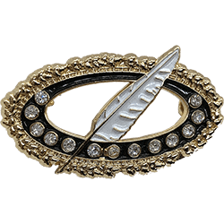
The pin’s finish can also have a big impact on contrast. (i.e. Gold text looks terrific against a royal blue or black background). Dark metal pins require lighter enamel colors – especially Black Nickel and Dyed Black finishes. The dark metal makes the colors appear at least one chip color darker than they really are (i.e. a bright red appears more maroonish). Light pastels work wonderfully on Black finish pins. Small text is usually made in metal. A bright silver metal pin with raised and shiny silver text will not work with a light gray background any better than a gold finish pin with a gold or tan background. Once again, contrast is the key. Let our color experts guide you in getting the best bang for your buck!
Gradients and the walls of separation:
Gradients are not possible on an enamel pin (only on an offset printed pin). Gradients will be converted to a single color on enamel pins (i.e. a reddish orange sky will be converted to the most dominant color – red or orange). Making sure the artwork doesn’t have gradients, or specifying replacement colors for areas containing gradients.
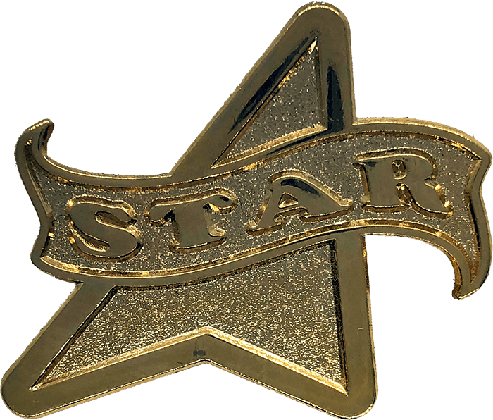
In order to keep one enamel color from flowing into another, creating a mess, metal walls must be used, which is why everything not silk screened is outlined in metal. This also means that if you have too many detail colors and lines on your pin, the design can quickly become a large blob of metal. One reason why we use block letters whenever possible is because if you put a line of color in a thin letter, you’ve just made two lines of metal (to hold in the line of color). As you can see, this means that the letter is two thirds metal and one third color, which usually doesn’t look good. The simpler the design, the cleaner the final product. Confusing? Trust us to modify your artwork so that it will look its best when made in metal, after all, we’ve been doing this for over 20 years and we want your custom lapel pin to look as good as you do!


